How Data Storytelling Changes Executive Decision Making
- Mandy Geyer

- Mar 11
- 3 min read
One of the biggest communication mistakes technical professionals make is assuming that accurate data automatically tells the story.
It rarely does.
In reality, the way information is framed can completely change how leaders interpret it and what decisions they make.
Earlier in my career, I saw the power of data storytelling firsthand while helping a client prepare to present their healthcare benefits costs to senior leadership.
The underlying analysis didn’t change.
But the way we communicated it transformed the entire conversation.
The Challenge of Communicating Healthcare Costs to Executives
Anyone who has participated in a healthcare benefits review meeting knows they can be tense.
Healthcare costs are rising, leadership wants answers, and analysts typically walk in with detailed exhibits explaining the annual rate increase.
This meeting was supposed to be one of those.
But the story behind the numbers was actually very positive.
For several years in a row, the client’s health plan had increased by less than 3% annually.
If you don’t work in healthcare, that might not sound remarkable. But healthcare costs typically grow much faster than general inflation, and many employers experience annual increases closer to 5–8% or more.
Even better, this improvement coincided with a new Director of Benefits who had implemented several smart changes to the program.
So there was a strong story to tell.
The problem?
Most executives don’t know what “good” healthcare cost trend looks like.
If we presented the standard actuarial pricing exhibit, leadership would likely see a 2–3% increase and interpret it the same way they interpret CPI.
Which meant they would completely miss the real story.
The Typical Way Analysts Present Data
This is what the traditional pricing exhibit might look like.
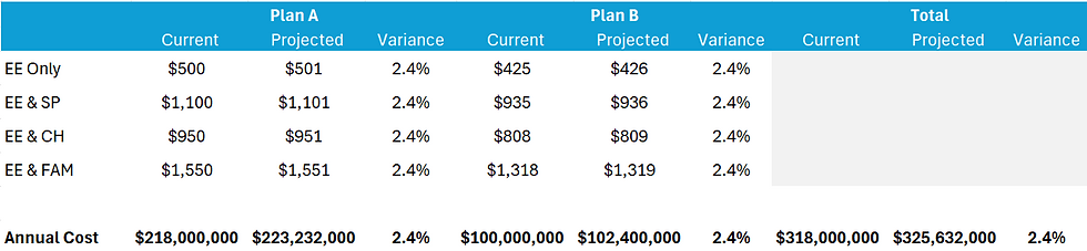
Technical exhibits like this are common in analytics presentations. They are accurate and detailed, but they often fail to answer the question executives are really asking:
Are we managing this cost well compared to the market?
Without context, decision-makers have no way to determine whether the result is good, bad, or average.
This is a common problem when presenting analytics to leadership.
The analysis may be correct, but the story isn’t clear.
Reframing the Analysis Through Data Storytelling
Instead of presenting the rate table first, we asked a different question:
What does our audience actually care about?
Executives are responsible for financial performance. They care about how much the company is spending and whether costs are being managed effectively over time.
So we reframed the analysis.
Rather than focusing only on the annual percentage increase, we compared the company’s healthcare cost growth to broader market trends and quantified the financial impact of their strategy.
This approach transformed a technical analysis into a financial storytelling narrative leadership could immediately understand.
The Slide That Changed the Conversation

This slide told a completely different story.
Instead of simply stating:
“Your healthcare costs increased about 2.4% this year.”
It showed that the company had avoided approximately $100 million in healthcare costs compared to typical market trends.
The slide also highlighted how the organization was performing better than the market, reinforcing the success of the benefits strategy.
The Impact of Better Data Communication
That single slide changed the tone of the entire meeting.
What are often contentious discussions about rising healthcare costs became conversations about how effectively the program was being managed.
Leadership could clearly see the impact of the strategy.
The Director of Benefits received recognition for the improvements she had implemented.
And the organization gained confidence in the program moving forward.
All without changing the underlying analysis.
Only the framing changed.
The Key Lesson for Data and Analytics Professionals
Many analysts default to the same exhibits year after year.
Those exhibits are valuable for explaining technical details, but they are not always the best way to communicate insights to decision-makers.
The most effective data storytelling starts with a simple question:
How will my audience interpret this information?
When technical professionals step back and consider their audience’s perspective, they often discover a more powerful way to communicate the same data.
Sometimes the most impactful improvement you can make isn’t additional analysis.
It’s simply telling the story differently.
Because when the story is clear, the numbers finally have the impact they deserve.
Improving How You Communicate Data to Executives
If you work in analytics, actuarial science, or data science, your ability to communicate insights clearly to leadership can be just as important as the analysis itself.
When done well, data storytelling helps decision-makers:
Understand what the data means
Evaluate whether results are good or bad
Take action based on the insight
And sometimes, as in this example, it can turn a routine cost discussion into a story of real financial success.


Comments